Persistent Location Tracking: Looking For A Few Good Data Points
In this post, I revisit the question of whether Google Latitude meets my persistent location tracking needs. In my previous post, I compared Google Latitude to InstaMapper and concluded that the latter is too battery-intensive. By looking at maps and base-level insights from the data, I suggest that Google Latitude optimizes for battery life at the expense of data quality.
Exhibit A: Some Maps #
I started gathering data on Oct. 3, 2012:
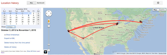
Since then, Valkyrie Savage and I have travelled to Boston and Chicago. Our stopover in Phoenix is clearly visible at this scale. You can barely make out our day trip to Mount Monadnock, NH over near Boston. Here's a closer look at that trip:
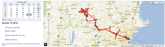
Ouch. The data is noisy in some areas, sparse in others. It's fairly clear that we took Hwy 2 over, but some of the GPS readings are miles off. Let's zoom in on that hike:
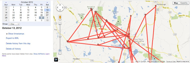
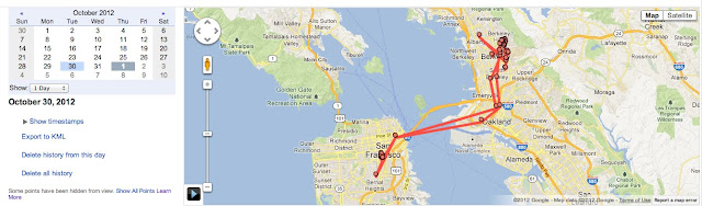
Only five data points actually lie within the park/mountain boundaries. That's five data points for a four-hour hike. Our Boston data is somewhat more accurate:
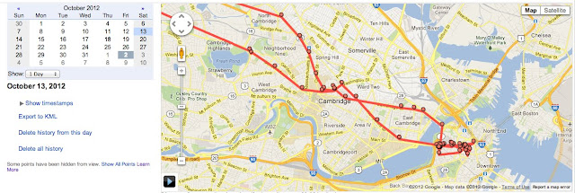
Still, the red line cuts through city blocks with reckless abandon. Either we're flying, or we're packing some incredibly efficient demolition equipment.
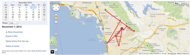
Here's the map for one of my more itinerant Bay Area days:
I cycled to a doctor's appointment, visited BiD to hear Mary Czerwinski speak about emotion tracking, worked from home for a bit, went into San Francisco to meet up with Lev Popov, and finally dragged myself home again.
The BART ride into San Francisco is understandably sparse: most of it is separated from cell towers and GPS satellites by rock and/or water.
Most of my travel is on foot, by bike, or via public transit. Not content with the Mount Monadnock hike data, I tried another quick drive up into Tilden:
Google Latitude captured just four points during the 20-minute drive.
Exhibit B: Some Analysis #
You can see the code for this analysis here and here.
After trudging through several lackluster map views, I'm left with a nagging impression:
This data isn't that useful.
This impression deserves further analysis, so I grab the KML to answer some of my questions. First off: how often is Google Latitude checking my location?
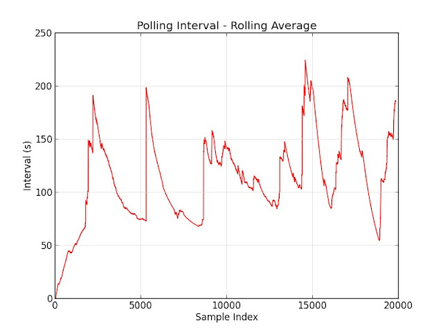
About every two minutes. GPS is a huge battery drain; increasing the time between updates can help by allowing the GPS radio to enter an idle state. How are those location readings scheduled?
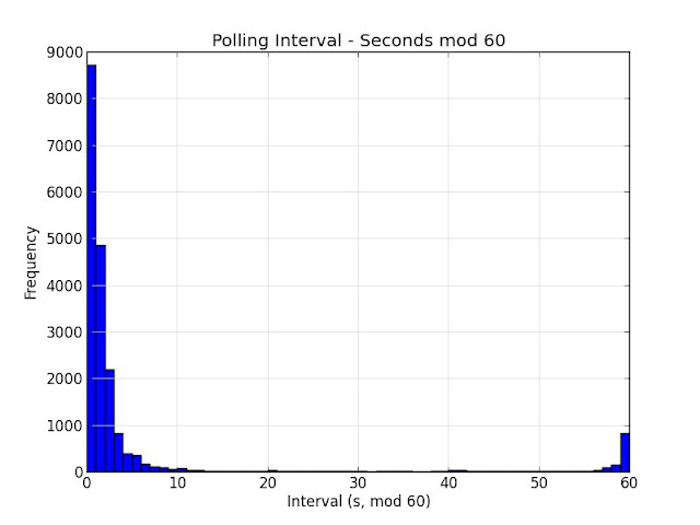
Google Latitude really likes spacing its readings out by a whole number of minutes.
How accurate is the data? The KML doesn't provide accuracy estimates for its locations. Fortunately, the Google Latitude API does, so I retrieve my data using this script and look at the accuracy readings:
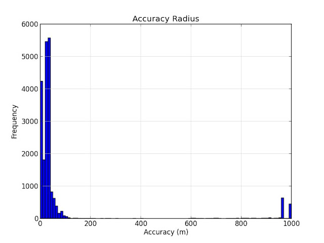
Actually, the readings have fairly high accuracy. Only 7% of readings have a reported error radius greater than 100m.
The maps above suggest that location readings are less accurate while travelling at high speed. Is that true? The API provides speed estimates for some readings, but this data is kind of sparse:
$ python speed.py < history.api
found 7429 speed values among 20898 readings
I try a different method: the Haversine distance formula, which gives me the distance between two points on the Earth's surface:
def haversineDistance(A, B):
  """
  Distance (in meters) between two Locations. Uses the Haversine formula.

  See http://www.movable-type.co.uk/scripts/latlong.html for corresponding
  JavaScript implementation.
  """
  # Earth's radius in meters
  R = 6371009
  dLat = math.radians(B.lat - A.lat)
  dLon = math.radians(B.lng - A.lng)
  lat1 = math.radians(A.lat)
  lat2 = math.radians(B.lat)
  sLat = math.sin(dLat / 2.0)
  sLon = math.sin(dLon / 2.0)
  a = sLat * sLat + sLon * sLon * math.cos(lat1) * math.cos(lat2)
  c = 2.0 * math.atan2(math.sqrt(a), math.sqrt(1.0 - a))
  return R * c
I use this distance formula to get a plot of accuracy versus travelling speed:
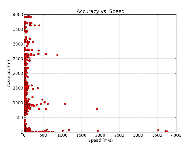
No clear correlation here; there are low-quality readings at both low and high speeds. There are several possible explanations:
- Confirmation bias: I mistakenly extrapolated a small handful of low-quality readings taken at high speeds to a general pattern.
- Misinterpretation: Some of the Mount Monadnock readings look way off; perhaps the error radius doesn't mean what I think it does.
- Different location sources: Location accuracy is relatively well-defined for GPS, but I'm not sure what happens when cell towers or WiFi access points are incorporated into location fixes.
- Longer sampling interval: Maybe Google Latitude assumes that precise location tracking is less important when driving.
To test this last hypothesis, I also plot sampling interval versus speed:
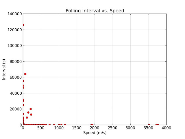
Nothing conclusive there.
Conclusion #
The problem appears to be sampling frequency. To reduce battery usage, Google Latitude polls about once every two minutes. While it has some mechanism for polling more often in periods of high activity, it's unclear how that works.
Reliance on fixes from cell towers and WiFi may be reducing location quality in more remote areas. Testing this hypothesis is difficult: how do you quantify remote? One possibility is to compute nearest-neighbor distance against a database of cities. Another confounding factor is the reliability of those accuracy values. Improving upon that would likely involve manual labelling.
Why Do This? #
Accuracy is not binary.
In Quantified Self applications, we use personal data to drive changes in our lives. We put a lot of trust in the accuracy and relevance of that data, and we extend that trust to the tools and services that collect it. We trust Fitbit to track our fitness. We trust Zeo to improve our sleep. We trust Lumosity to train our perception and attentiveness.
In giving so much trust to these tools, we sometimes forget that data are not infallible. Physics guarantees that there is no such thing as perfect data. All data contain error. As a system consisting of geosynchronous satellites that travel at relativistically significant speeds and beam data through our multilayered atmosphere to tiny chip radios sandwiched between layers of dense circuitry, GPS is understandably error-prone. When your chosen tools and services add noise on top of that, it's reasonable to ask:
How much trust should I place in the output?