Quadtree Cartography
In this post, I show off some images from a project I'm working on (which will remain nameless for now!) These images visualize subdivisions of the Earth into Google Maps tile-sized regions with roughly equal population. I'll also provide a brief and non-technical rundown of the process by which I generated these images.
The Images #
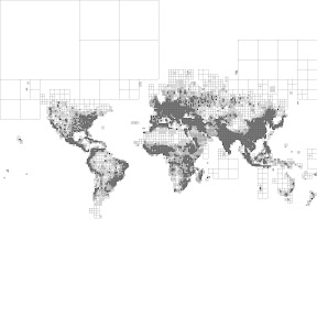
First, a representative image from my renderings:

I love working on problems with a visual aspect - you get direct sensory
feedback on your progress!
Here, we can clearly see the continents delineated by dense coastal population clusters. India and China are especially detailed, and Europe has fairly uniform density throughout. Contrast this with North America: northern Canada is sparsely populated, as are the deserts and mountains of the Central United States.
Next, some renderings at different subdivision levels (Google Maps zoom levels 8-11):


As the subdivision level increases, the continents progress from blocky pixel art to more recognizable shapes.
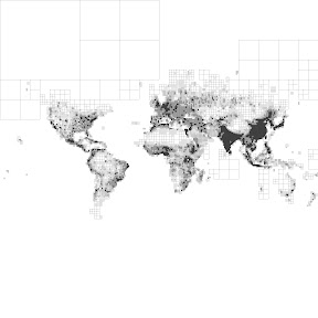
Finally, some renderings with different resolutions of the underlying population data (degree, half-degree, quarter-degree, and 2.5 arc minutes):


Here the effect is more subtle: detail is added in densely populated areas, but larger tiles (corresponding to more remote regions) are mostly unaffected.
To see all the images as small multiples, view the album on Picasa.
The Process #
There are four major steps: getting the data, combining it with Google Maps tile data, building the subdivision, and rendering it.
Getting the Data #
The NASA Socio-Economic Data and Applications Center, or SEDAC, compiles global population grids. These grids contain the estimated number of people living in each 2.5-arc-minute square of the Earth's surface. 2.5 arc-minutes is 1/24 of a degree, or about 4.5 km of equatorial circumference: definitely high-resolution enough for building some awesome maps!
The population count grids are available here. You have to register on the site and cite usage of their data, but otherwise it appears to be freely available.
Combining with Google Maps #
Google Maps uses a Mercator projection. This projection is truncated at roughly 85 degrees latitude to create a square map, which is then projected onto a 256 x 256 world coordinate system. Finally, world coordinates are mapped to pixel coordinates at different zoom levels, which determine which tile your location falls in.
To match up the gridded population data with Google Maps tiles, then, we need to do the following:
- for each grid cell, determine its latitude and longitude boundaries;
- use those boundaries to figure out which map tiles the cell overlaps;
- divide the cell's population among those map tiles.
To divide the cell's population fairly, I determine how much of the cell overlaps each tile.
I found this helpful example of working with locations, world coordinates, pixel coordinates, and tiles. The source code of that example contains an implementation of Google's Mercator projection, which I built into a larger node.js utility for computing the equal-population subdivision.
(Yes, node.js is fine for CPU-intensive tasks, just not in the same process as your webserver.)
Building an Equal-Population Subdivision #
To get map tiles of equal population, I combine tiles into larger tiles until the population exceeds a threshold. This creates large tiles in sparsely populated areas while leaving smaller tiles in densely populated areas.
(I mentioned quadtrees in the title of this post - this data structure is ideally suited for the problem.)
Rendering the Subdivision #
This is the easy part! I used Pillow, a nicely-packaged version of the excellent Python Imaging Library, to render the subdivisions out as JPEG images.
(I suppose I could have rendered SVG images in node.js using some jsdom and d3 hackery, but I was already familiar with using Python Imaging Library for image synthesis.)