A Tale of Two Trips
This summer, Valkyrie and I travelled through Eastern Asia. We started with the Great Barrier Reef and rainforests near Cairns, then went onwards to Singapore, Vietnam, Cambodia, Malaysia, and Korea before spending three typhoon-stricken days holed up in Manila, Philippines.
As with our bike trip, we kept a daily journal of our travels in blog form. In this post, I visualize the two trips from our blog entries using some simple word count graphs. These aren't the most sophisticated visualizations possible, but they provide a simple starting point to build upon in future blog posts.
First of all, it feels good to write another post! The rapidly upcoming Quantified Self 2013 Global Conference seemed like a good excuse to break seven months of blog neglect, so here I am.
I'll refer to these trips as Bike to the Earth and Ramblelust respectively, following the names of each trip blog. Let's start with a look at the broadest of broad textual measures, word count.
Word Count #
How many words did we write for each trip? How many per post, on average?
$ python global_word_count.py < BikeToTheEarth/posts_normalized.json
141329 words in 197 posts (717 words/post)

$ python global_word_count.py < Ramblelust/posts_normalized.json
61010 words in 86 posts (709 words/post)
Not much difference here. What happens if we graph the word counts over time? Top is Bike to the Earth, bottom is Ramblelust.
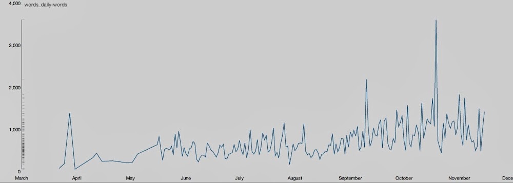
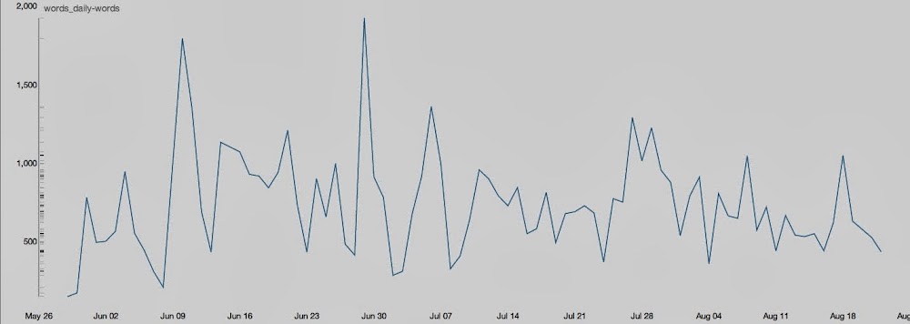
One point jumps out on the Bike to the Earth graph: this post, a massive 3600-word whopper that details our arduous exit from the rain-stricken Albanian coastline and into Greece. For comparison, our longest post from Ramblelust was this one about our CouchSurfing experiences in Cam Ranh, a short distance south from Nha Trang along the Vietnamese coast.
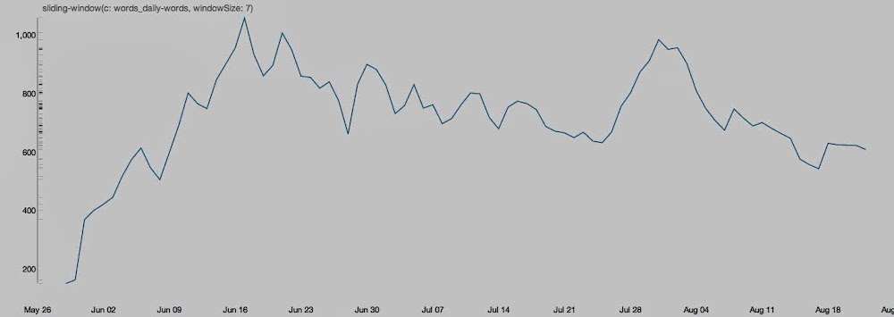
Still, it's hard to make much out of such noisy data. Let's smooth that a bit by looking at weekly averages. Again, top is Bike to the Earth, bottom is Ramblelust.
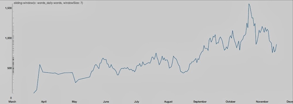
Now another pattern pops out of the Bike to the Earth data: sometime around the beginning of September, our writing output doubled. At that time, we were just entering Italy, where we were sandwiched in between the southern Alps and the sea for about 900km before reaching Rome.
As I go through this process, I'm constantly jumping back and forth between the blog posts and these graphs. As with all visualization, this context is an essential part of understanding the data.
Next Steps #
There are lots of places we could go from here:
- sentiment analysis;
- location-based visualization (by combining with country data);
- authorship analysis (my posts vs. Valkyrie's posts)...
...the list goes on. What would you like to see? Comment via Facebook or Twitter to let me know, and I'll put it into the next blog post.